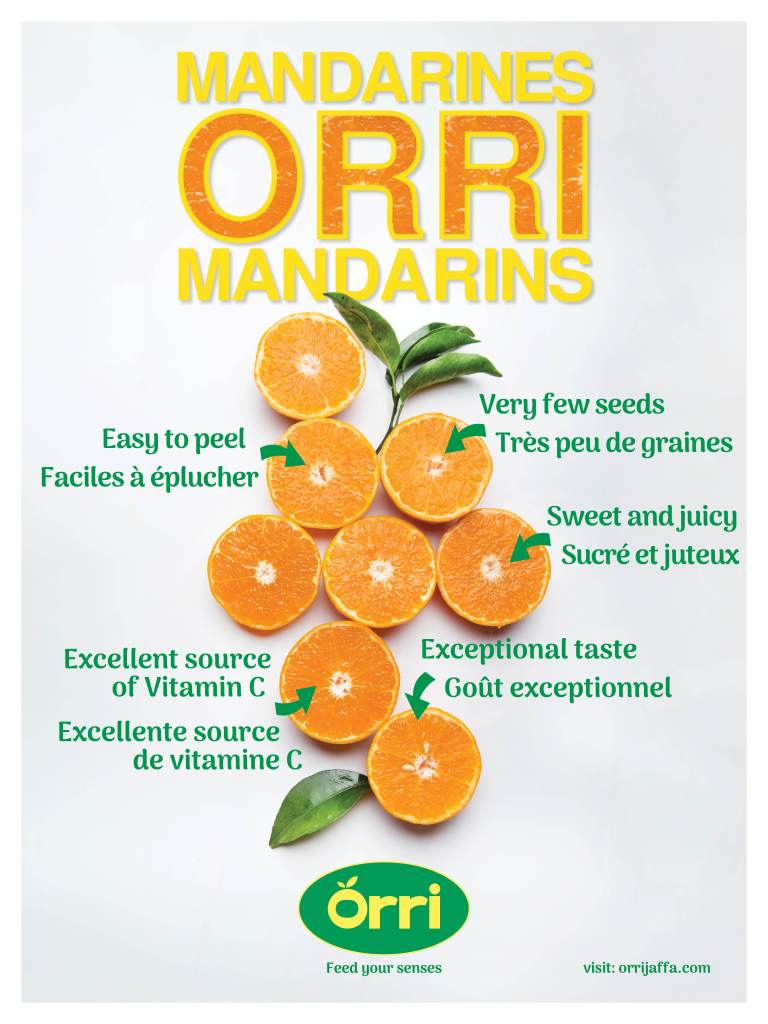
Client: Orri Mandarins
Web: orrijaffa.com
Project: Poster/Recipe Card
The task here was to design a poster and recipe card to be printed, displayed, and distributed in Longo’s (Ontario) and IGA (Quebec) stores during a week-long promo event. The main goal was to visually convey the qualities of Orri mandarins that set them apart from other brands – their juiciness and flavour. This was accomplished through careful selection of photography and copy, where the visibly juicy interiors of the fruit were front and center, complimented by copy that reinforced the product’s attributes.

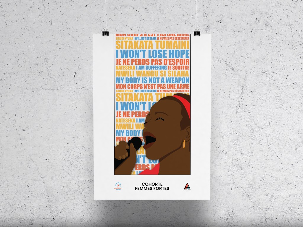
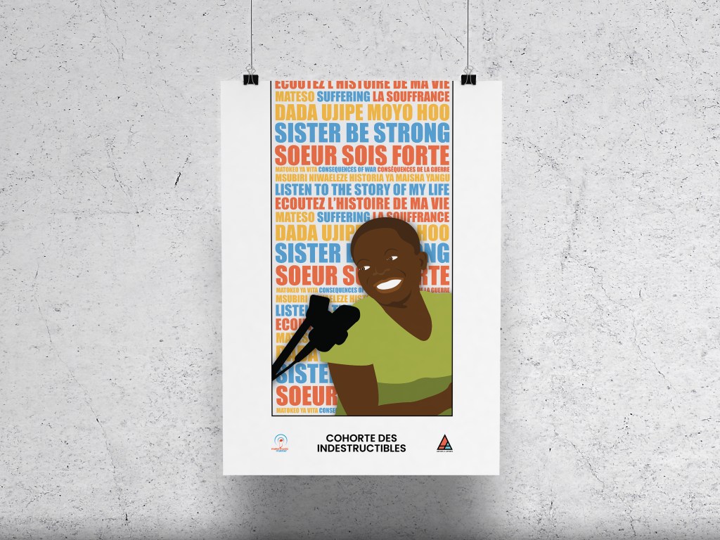
Client: A4A (Artists 4 Artists) Records
Web: a4amusic.com
Project: Printed Posters
The task here was to design a series of posters celebrating the artists of the A4A collective. These posters are being sold on the A4A website as a means to raise funds for A4A and the artists it represents. A4A wanted the posters to be creative, evocative of the artists’ music/message, and visually attractive enough to be hung in the homes of their audience as stand-alone pieces of art or as a complete set. Displayed here are the first 2 of the full series of 8.
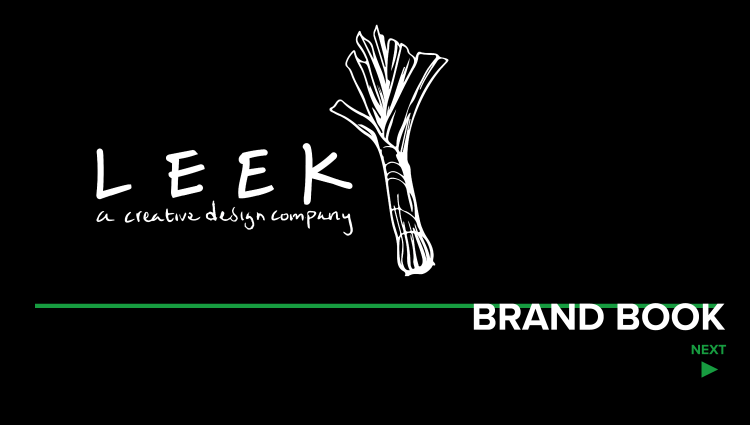
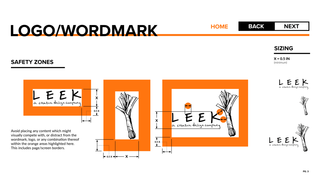
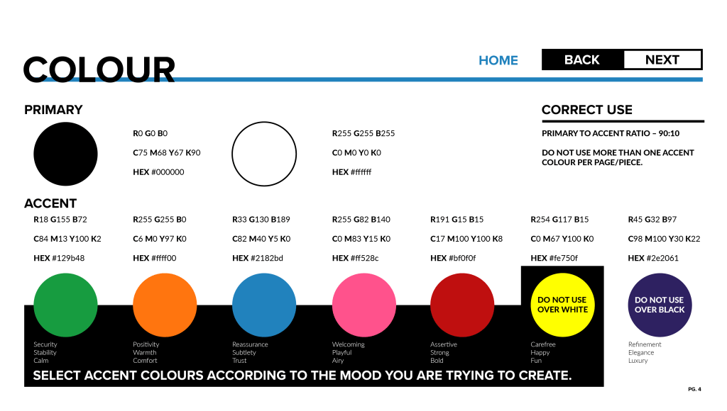
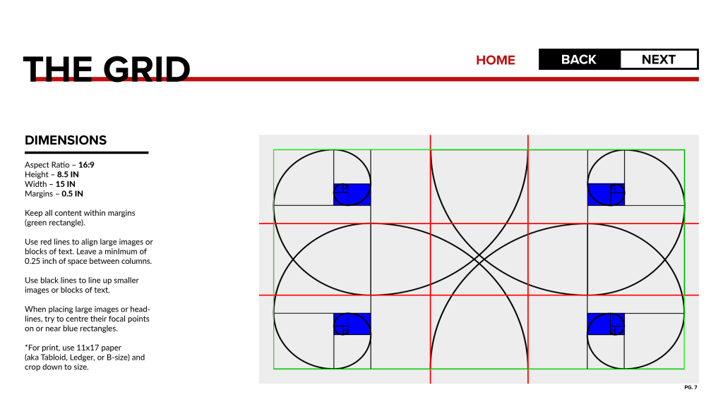
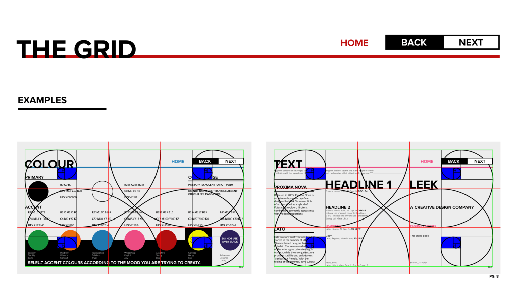
Client: Leek Productions
Web: http://leekprod.ca
Project: Brand Book
The task here was to develop a clear and concise set of guidelines around how the Leek Productions brand should be represented visually. I established rules regarding logo sizing and placement, colour selection and usage, typeface and font usage, and layout/composition guidelines. Having this guide empowers the client to create on-brand, consistent and attractive visuals independently. The brand book itself also serves of an example of the brand guidelines in use. The brand book also features interactive navigation functionality for ease and efficiency of use.


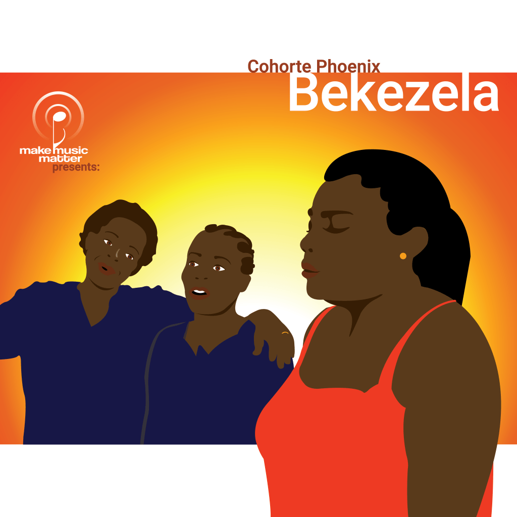
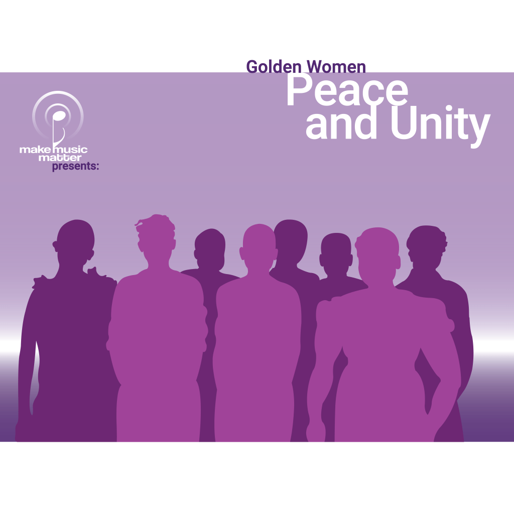
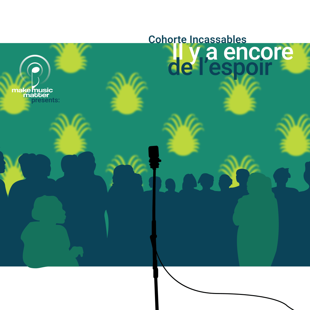
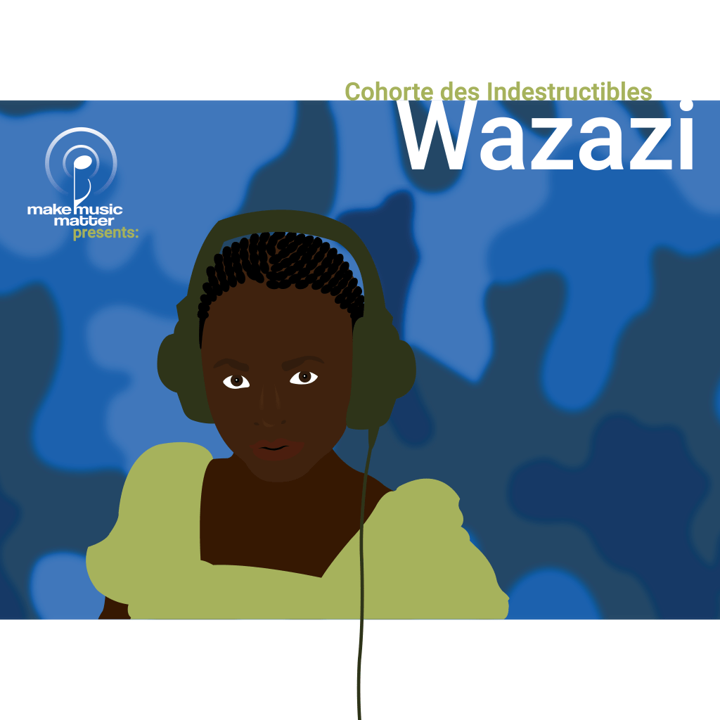
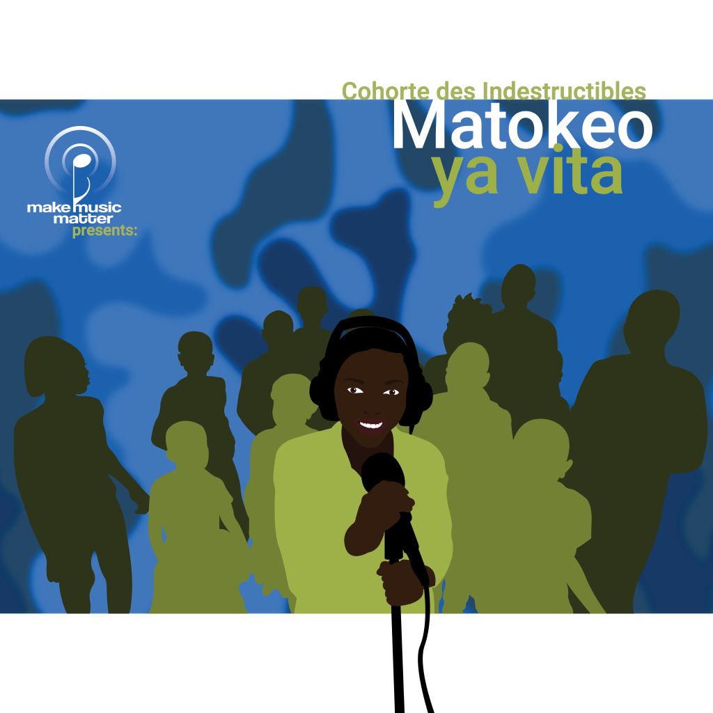
Client: Make Music Matter
Web: http://makemusicmatter.org
Project: Album Cover Art
The task here was to design artwork that would express the mood of the music. For example, “Sitakata tumaini” was written by survivors of sexual trauma who create music to facilitate the healing process. Translated to English it means “I will not give up hope.”
“Working with Marc is an absolute pleasure. He brings refreshing designs, out-of-the-box thinking, and creative problem-solving to the table. Marc’s positive energy
and professional attitude are appreciated by everyone
on the team.“
REBECCA PURVER, MEDIA & COMMUNICATIONS OFFICER, MAKE MUSIC MATTER
Client: A4A (Artist 4 Artists) Records
Web: a4amusic.com
Project: Spotify Avatars
The task here was to design several avatars to appear on the spotify pages of the many Artists represented by A4A Records. In the world of A4A, the term ‘Artist’ refers to a collective group of individuals, each Artist being tied to a specific location in the world where their music is recorded and produced. The goal was to create a unique avatar to serve as each Artist’s online identity, as well as tie in to their album artwork going forward. Each design was driven by the dominant emotions and ideas being expressed through the music. Themes ranged from sorrow and despair, to determination and hope.
“Marc is a very skilled Graphic Designer. His work is thorough, beautiful, and stunning. Marc has helped us reach the next level at A4A Records in showcasing our artists and their work. Working with Marc is a pleasure and I would highly recommend him to anyone looking for a reliable person and amazing design work.”
HEINE NIELSEN, PUBLISHING MANAGER , A4A RECORDS & PUBLISHING
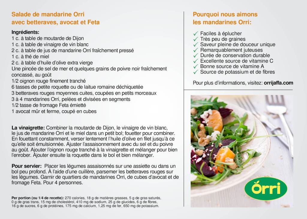
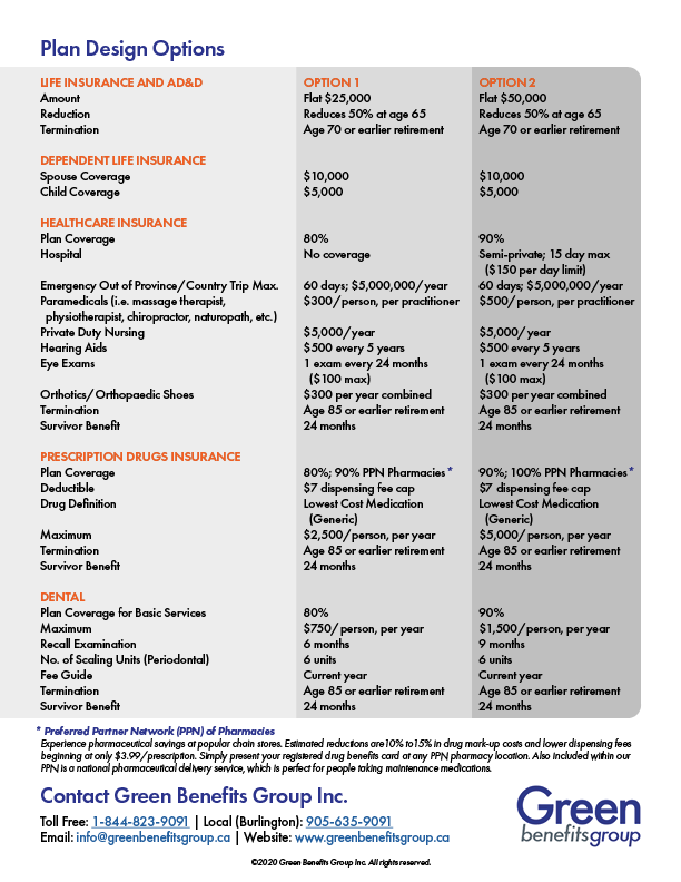
Client: Green Benefits Group Inc.
Web: greenbenefitsgroup.ca
Project: One Page Print & Interactive PDF
The task here was to design and layout an eye-catching, on-brand, one-page promo piece to distribute via digital & print platforms. My client wanted to update their existing one-pager, and in doing so make it more visually appealing and eye-catching. To do this, I incorporated stock photography and infographics, as well as other graphic embellishments to highlight the key messaging in the piece. I was given permission to stray from their brand guidelines (which they are considering updating), and introduce a bold new orange colour which would liven up and compliment their existing palette, which had a more understated and somber tone.
Here’s the flip-side:

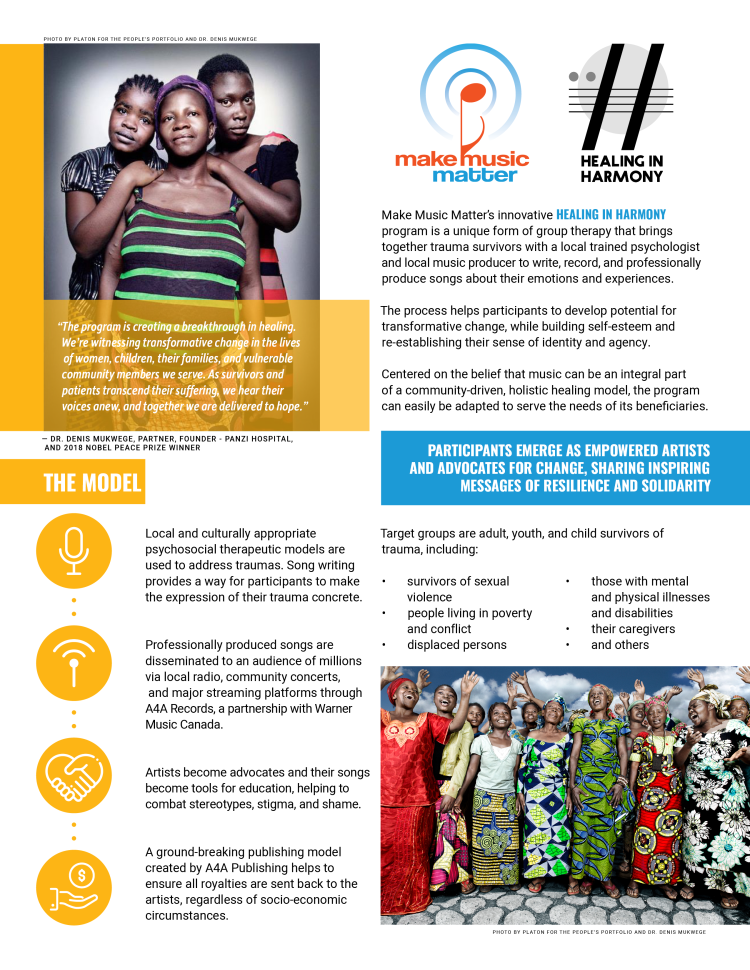
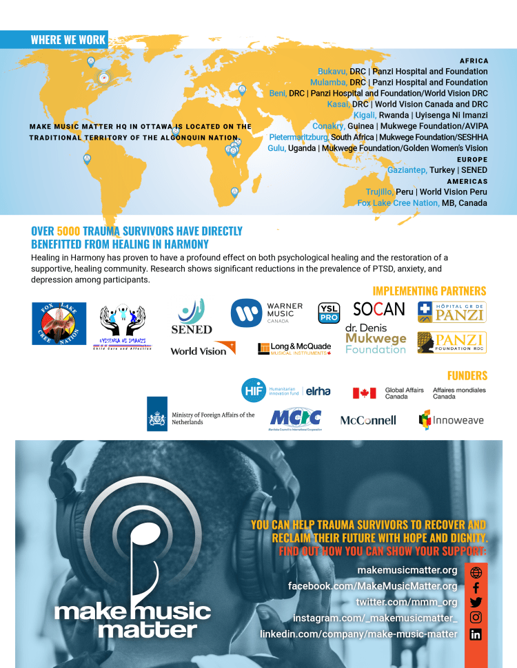
Client: Make Music Matter
Web: makemusicmatter.org
Project: One Page Print & Interactive PDF
The task here was to design and layout an eye-catching, on-brand, one-page promo piece to distribute via digital & print platforms. There was a lot of text that needed to be incorporated, and getting people to read more than a few sentences at a time these days can be challenging (thanks Twitter). To combat that, I used alignment and graphic embellishments to break the copy up into smaller, more digestible ‘blocks’ of content.
Here’s the flip-side:
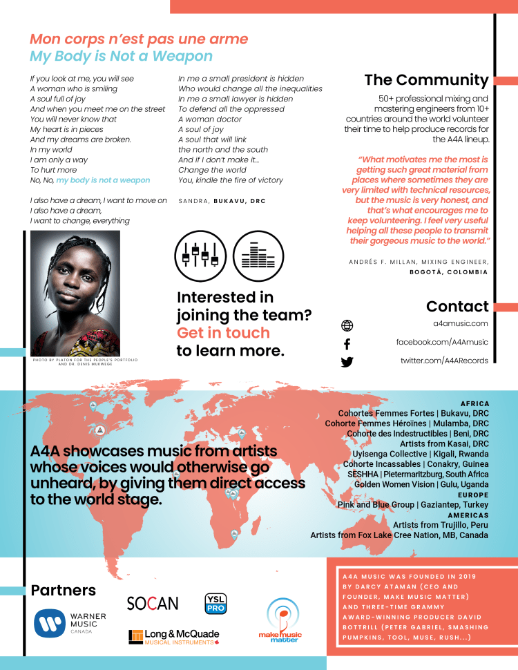
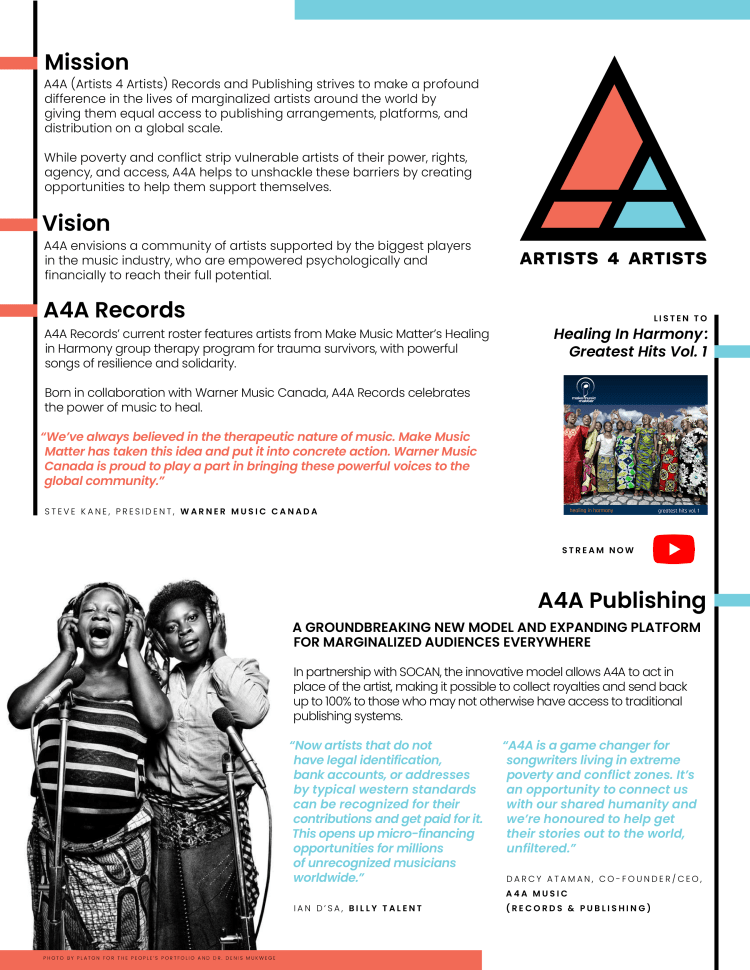
Client: A4A (Artists 4 Artists) Records
Web: a4amusic.com
Project: One Page Print & Interactive PDF
The task here was to design and lay out an eye-catching, on-brand, one-page promo piece to distribute via digital & print platforms. A4A Records works very closely with Make Music Matter, but it’s very important to each group that their branding remain distinct, unique, and consistent to each organization. Here’s an example of how applied use of colour palette, font selection, graphic embellishments, and page grids can be used to visually define a brand.
Here’s the flip side:
“What you are creating is bringing so much value to the
artists’ presentation, and globally as an organisation,
you are making us look better.”
DAMIAO FERNANDES, PRODUCTION ASSISTANT A4A RECORDS & PUBLISHING
Client: Loonie Logic
Web: loonielogic.ca
Project: Logo/Wordmark
The task here was to create a unique and playful logo for the Canadian financial independence blog, Loonie Logic. The topics of personal finance and retirement planning can seem overwhelming to some, so my client employs a casual, conversational tone to counter that. Loonie Logic uses light-hearted humour as a way to disarm and engage their readers, and the logo needed to reflect that.
